Tor Browser 13.0 is now available from the Tor Browser download page and our distribution directory.
This is our first stable release based on Firefox ESR 115, incorporating a year's worth of changes shipped upstream. As part of this process we've also completed our annual ESR transition audit, where we review Firefox's changelog for issues that may negatively affect the privacy and security of Tor Browser users and disable any problematic patches where necessary. Our final reports from this audit are now available in the tor-browser-spec repository on our Gitlab instance.
Particularly notable are the accessibility improvements we've gained as a result of the transition to Firefox ESR 115. While eagle-eyed users may notice small visual changes to the user interface (for example, internal links are now underlined), Tor Browser 13.0 is our first release to inherit the redesigned accessibility engine introduced by Mozilla in Firefox 113. This change promises to improve performance significantly for people who use screen readers and other assistive technology.
What's new?
Refreshed application icons
Earlier this year we spent some time artworking the Mullvad Browser logo into the various assets needed to support its release – including application, installer and document icons that conform to each platform's conventions. While getting up to speed with the current requirements for each platform, we identified a number of gaps with Tor Browser too, and started working on new icons for Tor Browser in parallel.
For context, Tor Browser's current icon (sometimes referred to as the "onion logo") was selected by community poll over four years ago to succeed the older purple and green globe in Tor Browser 8.5. Given the community's involvement in its selection, its recognizability by netizens, and the simple fact that we still love the existing icon, we chose to focus on refining rather than replacing it entirely.
One of the motivations behind work like this is our philosophy that privacy-preserving products shouldn't be purely utilitarian, but can also spark joy. However there are practical benefits too: adhering to platform conventions provides better consistency, discernible application and installer icons help prevent user error, and attracting new users benefits everyone because anonymity loves company.

New homepage
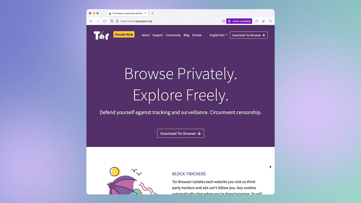
For the past year we've been working on a significant rewrite of Tor Browser's back-end, which recently provided us with the opportunity to rebuild one of the few internal pages that hasn't changed in a while: the homepage (often referred to by its internal reference, "about:tor"). Tor Browser 13.0's homepage now features the new application icons, a simplified design, and the ability to "onionize" your DuckDuckGo searches by switching to the DuckDuckGo onion site. Continuing the work that began in Tor Browser 12.5 to improve the browser's accessibility, the redesigned homepage also offers better support for users of screen readers and other assistive technology too.
Existing Tor Browser users can rejoice that the "red screen of death" – an infamous error state that the previous homepage would occasionally trip itself into – is long gone. As part of the back-end rewrite we've removed the automatic Tor network connectivity check that was a hold-over from the legacy tor-launcher, where bootstrapping was handled by an extension that ran before the browser interface appeared. As a result of the tighter tor integration and in-browser bootstrapping experience introduced in Tor Browser 10.5, the old logic behind this check would often fail and present some users with the red screen of death, even if their connection was fine.
In fact, all of the reports we've received of users hitting this screen with the default tor configuration since Tor Browser 10.5 have proven to be false positives, causing undue alarm. Although the check is arguably still useful for users running non-default configurations, neither of the main environments which do so – Tails and Whonix – use about:tor as their default new-tab or home pages. For everyone else, we've added a new banner to the redesigned homepage in place of the red screen of death to check that tor is connected and working as expected.

Bigger new windows
The explanation for how and why Tor Browser works this way is going to get into the weeds a little, so be warned. However the main thing to take away is that new windows should be bigger by default and present themselves in a more useful landscape aspect-ratio for the majority of desktop users in Tor Browser 13.0. Now, about those weeds...
Letterboxing was introduced in Tor Browser 9.0 to allow users to resize their browser window without fear of being fingerprinted by rounding the inner content window (sometimes referred to as the "viewport") down to multiples of 200 x 100 pixels. This technique works by grouping the window sizes of most users into a series of common "buckets", protecting individual users within those buckets from being singled-out based on their window or screen size.
In order to preserve these protections when opening new windows, Tor Browser overrides platform defaults and will instead select a size that conforms to our letterboxing steps up to a maximum of 1000 x 1000 pixels. However, while that may have been fine in the past, a max width of 1000px is no longer suitable for the modern web. For example, on many newer websites the first responsive break point lies somewhere in the range of 1000 – 1200px, meaning by default Tor Browser users would receive website menus and layouts intended for tablet and mobile devices. Alternatively, on certain websites, users would receive the desktop version but with the annoyance of a horizontal scroll bar instead. This, naturally, would lead to users of these websites needing to expand each new window manually before it's usable.
In response we've bumped up the max size of new windows up to 1400 x 900 pixels and amended the letterboxing steps to match. Thanks to the increase in width, Tor Browser for desktop should no longer trigger responsive break points on larger screens and the vast majority of our desktop users will see a familiar landscape aspect-ratio more in-keeping with modern browsers. This particular size was chosen by crunching the numbers to offer greater real estate for new windows without increasing the number of buckets past the point of their usefulness. As an added bonus, we also expect that Tor Browser users will not feel the need to manually change their window size as frequently as before – thereby keeping more users aligned to the default buckets.

Technical notes
We're pleased to report that we've made the naming scheme for all our build outputs mutually consistent. Essentially, this means that going forward the names of all our build artifacts should follow the format ${ARTIFACT}-${OS}-${ARCH}-${VERSION}.${EXT}. For example, the macOS .dmg package for 12.5 was named TorBrowser-12.5-macos_ALL.dmg, whereas for 13.0 it's named tor-browser-macos-13.0.dmg.
If you are a downstream packager or download Tor Browser artifacts using scripts or automation, you'll need to do a little more work beyond just bumping the version number to support this and future releases.
Contributions 💜
Thanks to all of the teams across Tor, and the wider community, who contributed to this release. In particular we'd like to extend our gratitude to the following volunteers who have contributed their expertise, labour, and time to this release:
- anonym
- cypherpunks1
- Fabrizio
- FlexFoot
- guest475646844
- honorton
- ilf
- JeremyRand
- nervuri
- Rusty Bird
- shanzhanz
- thorin
- trinity-1686a
Send us your feedback
If you find a bug or have a suggestion for how we could improve this release, please let us know.
Full changelog
The full changelog since Tor Browser 12.5.6 is:
- All Platforms
- Windows + macOS + Linux
- Windows + Android
- Windows
- macOS
- Linux
- Android
- Build System
- All Platforms
- Windows + macOS + Linux
- Windows
- macOS
- Linux
- Android


